Grid Container(그리드 컨테이너)
그리드의 단위로는 % px vh fr 다 사용가능 혼용도 가능하다.
fr은 전체화면의 몇만큼 차지할지 정해주는것 flex-gro와 비슷함

부모요소
| 속성 | 비고 | 작성 |
| display: grid; | 그리드로 디스플레이 변경하기 | |
| grid-template-columns | 부모 안에 배치할 칼럼,로우 크기와 개수 | grid-template-columns: 200px 200px 200px; grid-template-rows: 100px; width200px, heihgt: 100px인 box생성 |
| grid-template-rows | ||
| repeat | 위처럼 template을 사용하면 코드가 길어지는 단점이 있다. 반복시켜 편의성을 높혀준다 | grid-template-columns: repeat(3,200px); grid-template-rows: repeat(3,100px); |
| minmax | 최소값,최대값 설정 | minmax(최소값,최대값); |
| grid-auto-columns | 부모 안에 배치할 로우 크기와 개수를 파악하기 어려울때 | grid-auto-rows: 값; grid-auto-columns: 값; minmax사용가능 |
| grid-auto-rows | ||
| auto-fill | colum의 개수를 정하지않고 너비가 허용한한 최대한 셀을 채운다. | grid-template-columns: repeat(auto-fill, minmax(20%, auto)); |
| auto-fit | colum의 개수를 정하지않고 너비가 허용한한 최대한 셀을 채운다. | grid-template-columns: repeat(auto-fit, minmax(20%, auto)); |
| grid-gap | 셀과의 간격 | grid-gap: row columns |
Grid Item(그리드 아이템)
자식요소
- grid-area | 그리드 레이아웃 합치기
grid-template-columns, grid-template-rows
부모요소에 적용
부모 안에 배치할 칼럼,로우 크기와 개수 정하기
repeat을 사용한 행,열은 동일한 값이여야한다는 조건이 있다
모두 각각 다른 값을 주고 싶다면 해당 속성을 사용해야한다

      .container {
        display: grid;
        grid-template-columns: 200px 200px 200px;
        grid-template-rows: 100px 100px 100px;
      }

 grid-template-columns: 설정하고싶은 width
 grid-template-columns: 설정하고싶은 height


    width: columns
    height: rows
repeat
부모요소에 적용
반복되는 수, 원하는 크기
단, 같은 값을 반복할때만 사용할 수 있다.ex) 200px 200px 200px = repeat(3,200px)200px 200px 100px = repeat(2,200px) 100px

repeat를 사용하지않을경우
/*
grid-template-columns: 200px 200px 200px;
grid-template-rows: 100px 100px 100px;
*/

위 코드를 repeat를 사용하여 줄여보자
grid-template-columns: repeat(3, 200px);
grid-template-rows: repeat(3, 100px);

/*해석*/
repeat사용한 값
grid-template-columns: repeat(3개의 행을, 200px로);
grid-template-rows: repeat(3개의 열을, 100px로);
------------------------------


다른값이 들어 있을 경우
/*
grid-template-columns: 200px 200px 100px;
grid-template-rows: 100px 100px 200px;
*/

repeat사용한 값
grid-template-columns: repeat(2, 200px) 100px;
grid-template-rows: repeat(2, 200px) 200px;
minmax(최소값,최대값)
부모요소에 적용
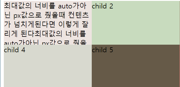
minmax(100px, auto); == 안에 컨텐츠가 없더라도 100px 의 최소값을 유지하고
안에 컨텐츠가 넘쳤을때 최대값으로 늘어날수 있는 사이즈는 자동이다.
최소너비의값과 지정한 최소너비에서 컨텐츠가 넘쳤을떄 어떻게 처리해줄건지 지정
max값을 auto로 지정하주지않으면 컨텐츠가 넘치게 됐을때 잘리게 된다.
잘리길 원하지않는다면 auto로 주면된다.

grid-auto-rows, grid-auto-columns
부모요소에 적용
minmax사용가능
repeat 사용불가능
grid-auto-rows: 원하는 값 혹은 grid-auto-rows: minmax(,);
grid-template-columns,row에는 정확한 값을 입력해주어야 하지만
auto값은 말그대로 크기값만 지정해주면 자동으로 행과 열을 생성해준다
아래코드를 예시로 들자면 row(열)부분이 3개 밖에 없을땐 눈으로 확인이 가능하시만
무수히 많은 row(열)이 있거나 미리 알 수 없는 경우에 사용해주면 된다
일일이 세지않아도 된다는 장점이 있다.

위 요소의 css값
.container {
display: grid;
grid-template-columns: repeat(3, 200px);
grid-auto-rows: 100px;
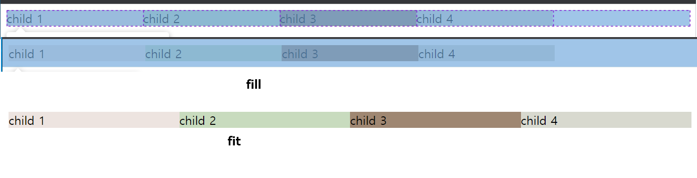
}auto-fill과 auto-fit의 차이점
부모요소에 적용
grid-template-columns: repeat(auto-fit, minmax(20%, auto));
행의 너비를 최소값20%라 설정했을떄
fill은 나머지부분을 20%인 하나의 셀을 하나 더 생성하여 100%를 유지하고
fit은 나머지 20%인 부분을 다른셀과 다 같이 나누었다
두 속성 전부 고정된 width를 주면 해당 영역보다 줄었을때 flex처럼 자식요소들이 탈락한다.

grid-gap
부모요소에 적용
그리드 셀과의 너비값 설정

grid-area, grid-template-areas:
부모요소에 적용 grid-template-areas:
자식요소에 적용 grid-area:
그리드 레이아웃 합치기
자식요소에 grid-area, 부모요소에 grid-template-areas를 정해줘야한다.


새싹 DT 기업연계형 프론트엔드 실무 프로젝트 2주차 블로그 포스팅
'CSS' 카테고리의 다른 글
| 2022-10-27 [새싹 프론트엔드] display: flex; (1) | 2022.10.27 |
|---|---|
| 2022-10-26 [새싹 프론트엔드] 반응형 웹 (0) | 2022.10.26 |
| 2022-10-25 [새싹 프론트엔드] 목록태그 (0) | 2022.10.25 |
| 2022-10-24 [새싹 프론트엔드] 테이블, CSS 레이아웃 강의정리 (0) | 2022.10.24 |
| 2022-10-21 [새싹 프론트엔드] 강의정리 (0) | 2022.10.21 |


